
Standardised letterforms: some notes on the origins of Isonorm
Alphabets referred to as “Isonorm” are rooted in a drafting letter style that was used in architectural drawings, technical reports and patent illustrations as a registered industry standard of the International Organisation for Standardisation (ISO), founded in 1947, but also echo lettering specifications referred to as Normschrift by the German Institute for Standardisation (Deutsches Institut für Normung, DIN), established thirty years earlier. Based on these original specifications and on lettering manuals that reference them, the following notes trace some of the influences that led to Isonorm.
In the early twentieth century architects and engineers utilised a variety of lettering styles including blackletter and calligraphic swash letters in their technical drawings. A particular genre that gained popularity was known as Blockschrift: block letters typically written with a round-nib pen, which allowed them to maintain a monolinear thickness in vertical, horizontal and diagonal strokes with round terminals.1 Typically constructed on a rather coarse grid, block letters loosely follow the spine (or skeleton) of Roman square capitals proportions, which has also earned them the name Skelettschrift.2 DIN defined this particular style as the Normschrift industry standard and, among their earliest entries, issued DIN 16 for an inclined hand-lettering alphabet in 1919, later followed by the upright companion DIN 17.
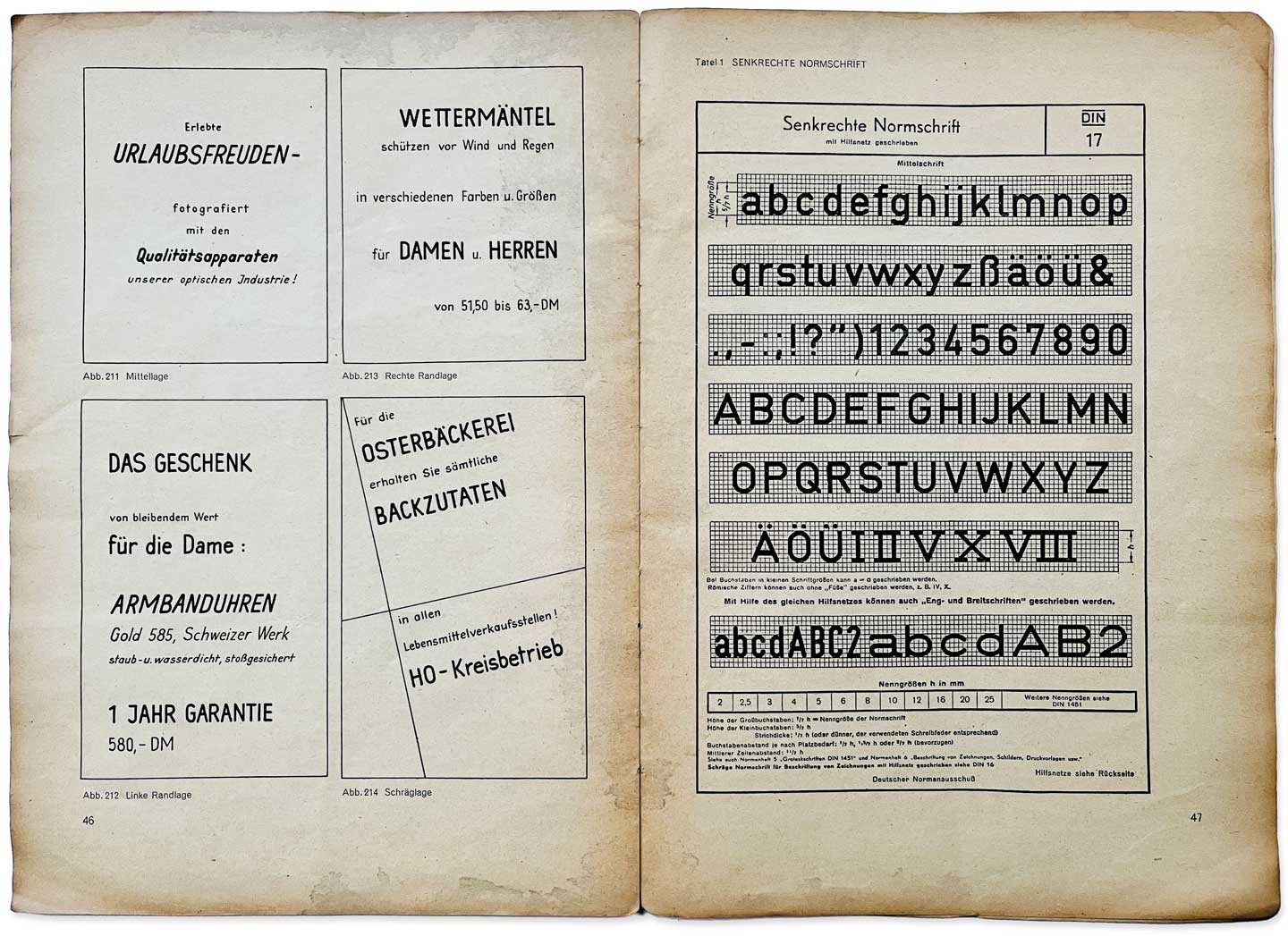
[1] Examples of Blockschrift hand-lettering in use for advertisements (left) and a chart of DIN 17, the upright Normschrift (right). Reproduced from Gutsche 1959, p. 46/47, from the collection of the author.
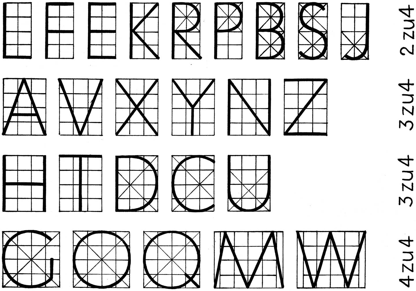
[2] Construction of Blockschrift based on the ‘skeleton’ of Roman square capitals. Reproduced from Kuhn 1968, p. 23, from the collection of the author.
In the original specifications that were clearly written up by engineers, the standard stroke thickness was recommended at 1/7 of the capital height, while the x-height was defined at 5/7. Conversely, the size of the writing tool determined the size of the letterforms. In the specifications for DIN 16 the angle of inclination is defined at 75 degrees (measured from the baseline), while typographers would of course refer to a 15-degree slant. According to a draftsman’s rule of thumb, a duo of set squares yields a 75-degree angle and thus provides a guide for inclined letterforms.3
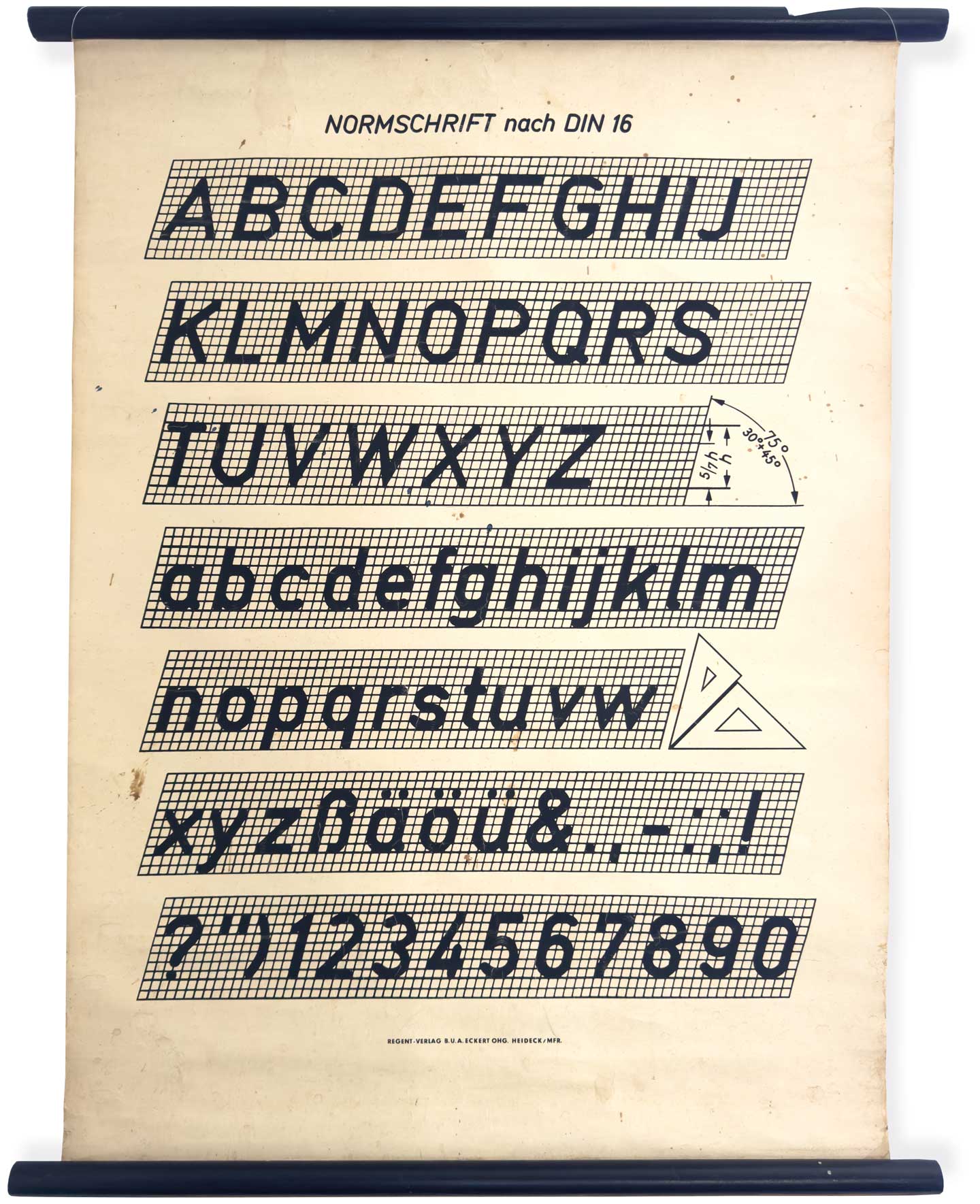
[3] Chart of DIN 16: inclined drafting letters for architectural drawings and technical reports. Iconic illustration of two set squares found in several drafting manuals at the time: one rectangular triangle with 90/45/45-degree angles and another with 90/60/30-degree angles, rendering a 75-degree guide for inclined letterforms. From the collection of Alexander Roth.
As early as the 1920s, the vernacular appearance of these drafting alphabets sparked the interest of type manufacturers. The D. Stempel type foundry released Normen-Reform-Grotesk-Kursiv in 1923, a design that remains close to the original DIN 16 (but with a classy long-s), followed shortly by Berthold who issued Dinorm-Grotesk-Kursiv in reference to the naming conventions of a DIN entry (known as Dinorm).4
[4] H. Berthold’s Dinorm-Grotesk-Kursiv, released in 1924. Titling sizes reproduced from the 1928 type catalogue Akzidenz-Schriften, Einfassungen, Vignetten of Spamersche Buchdruckerei (vol. 2, p. 183), with kind permission from the collection of Erik Spiekermann.
Well into the 1960s, several German lettering manuals reference DIN 16 and 17, but it is DIN’s contributions to paper formats that achieve greater relevance, in particular the A-series, devised by Walter Porstmann for DIN 476 in 1922. Based on a clever system that follows the ratio of 1:√2, each surface of a paper size equals one half of the surface of the next larger size. In 1975 it became an international standard as ISO 216 and remains in use globally with the exception of a few countries in the Americas, including the United States.
DIN’s most popular lettering standard is DIN 1451: an alphabet for industrial use, for signage and display purposes, popularised as ‘Dinschrift’. Its use in public signage and on road signs, most prominently on the Autobahn, has made it the predominant Normschrift in Germany.5 First introduced in 1931, it includes specifications for three widths: Breitschrift (wide), Mittelschrift (medium width) and Engschrift (narrow) — some have traced the origins of the latter to an early twentieth-century lettering template used by the Prussian Railways.
[5] Quite a rare sight: a slightly odd version of DIN 1451 Mittelschrift mixed with its companion Engschrift (in the bottom line). The unusual ‘a’, self-made italics, unreasonable word spaces and a capital ‘M’ that even true DIN experts have not seen before suggest that the ground authorities have some leeway in interpreting the lettering specifications. Photographed by Alexander Roth in his home town.
On the other side of the Iron Curtain, the Deutsches Amt für Maß und Gewicht (DAMG) was formed in East Germany. It issued standards under the elegant title Technische Normen, Gütevorschriften und Lieferbedingungen (TGL), many of which were continuations of previous DIN specifications, such as TGL 0-16 and 0-17 for drafting and TGL 0-1451 for signage lettering.
The specifications for DIN 16 and 17 were last updated in 1967 and then subsequently replaced by a new alphabet registered as DIN 6776 in 1976. According to the corresponding East German standard TGL 31034, this new alphabet considered implications of microfilm limitations, such as extreme photographic down-scaling.6
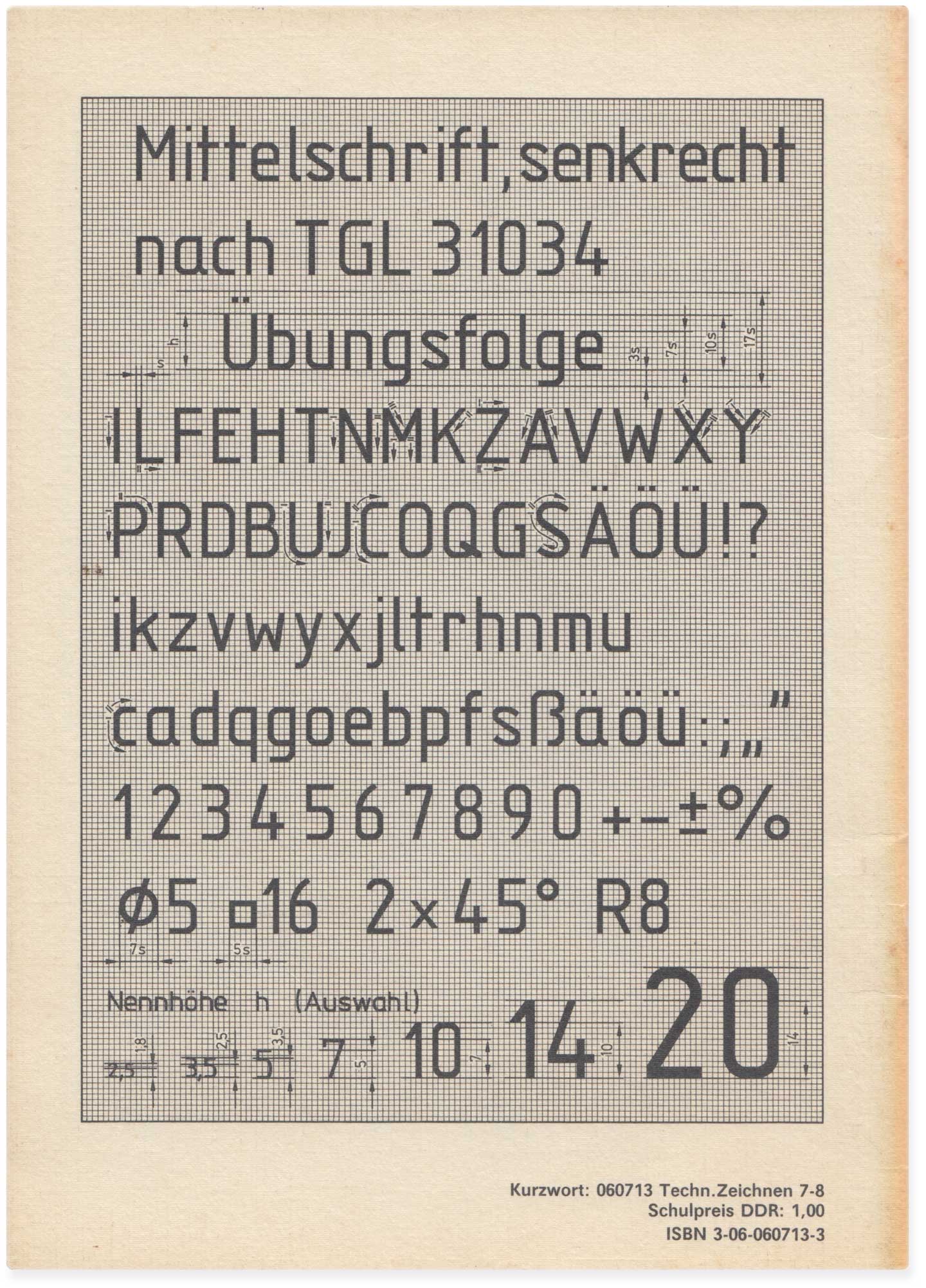
[6] TGL 31034 features a character set with a one-storey ‘a’. Reproduced from Horst Kummer et al: Technisches Zeichnen. Lehrbuch für die Klassen 7 und 8, Berlin: Volk und Wissen, 1987, from the collection of Alexander Roth.
In areas where bows typically transition into stems (b, d, g, m, etc.) the joins are kept flat, resulting in a spur-less lowercase character set. As a result, the alphabet appears rather squarish overall, lending it the vibe of a technoid Blockschrift. In another attempt to overcome the photographic reduction, the ratio of stroke thickness to cap height is recommended at 1:10, making it significantly thinner than DIN 16 and 17. While DIN 6776 is equipped with a two-storey ‘a’, the TGL version features a single-storey alternative in the upright style.
Shortly after DIN 6776 was an-nounced, it found its equivalent in the international standard ISO 3098. Over the years it was extended and became available in different styles: narrow (A) and normal-width (B), upright and inclined respectively (the rule of the 75-degree angle continued), followed by Greek and Cyrillic alphabets in addition to the existing Latin. DIN EN ISO 3098, as it is officially known in Germany, kept both alternates for ‘a’ and figure ‘7’ (with and without the crossbar) for many years.
ISO 3098 was lettered freehand by trained draftsmen and women, but official ISO stencil rulers served as guides for beginners. The use of lettering ruler guides follows a tradition that can be traced back to Georg Bahr’s Normograph stencil ruler around 1909, followed by the improved Standardgraph. In the 1970s, Aristo, Rotring and other manufacturers of drafting devices produced stencils that followed the ISO 3098 standard at different letter heights, while Rotring also supplied the corresponding pens (called Isograph) that matched those heights in each recommended stroke thickness.7
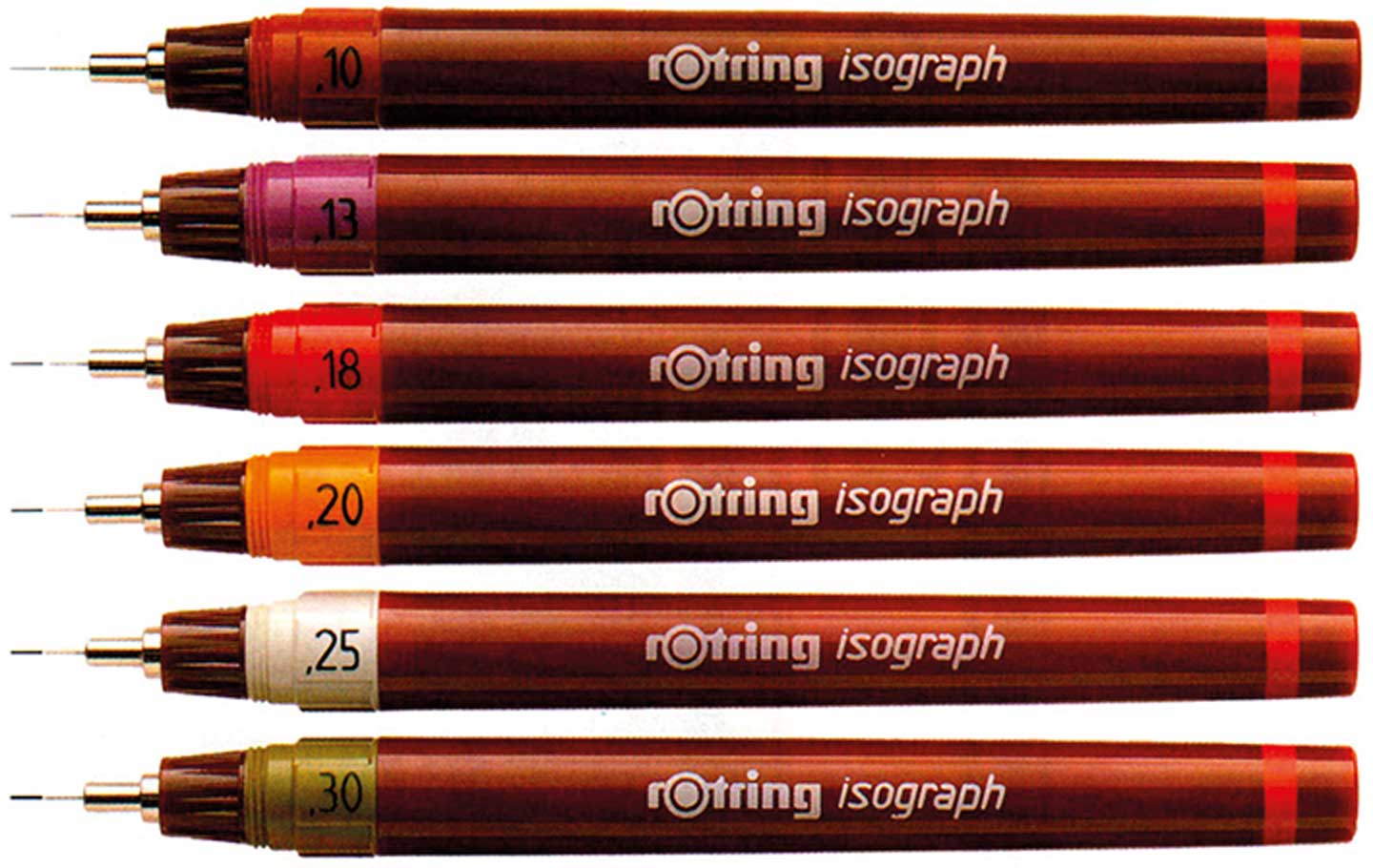
[7] Technical pens such as Rotring Isograph and Rapidograph followed a standardised set of nibs and a consistent color code for each nib size. Reproduced from the 1990 Rotring Catalogue, from the collection of Alexander Roth.
In addition to these analog lettering utensils, ISO 3098 later became available on CAD applications for plotters utilising numerically operated path control and on electronic label devices. In 1980, Rotring introduced the ‘NC-scriber’, a hand-held plotting device to replace ‘fine motorial dexterity and skilled routine’ (from a 1980 Rotring NC-scriber brochure) of what was previously performed manually in the drafting studio.8 The available lettering style was ISO 3098 ‘B’ on a 160×40 plotting area. A built-in micro-processor enabled a plotting motion in minute steps of 1/100 mm at high speed. By 1990, an updated model of the NC-scriber was equipped with three fonts (ISO 3098, DIN 1451 and DIN 17) in extended character sets for Greek and Cyrillic. Cassettes were introduced as data carriers for additional fonts and as a means to store memory.
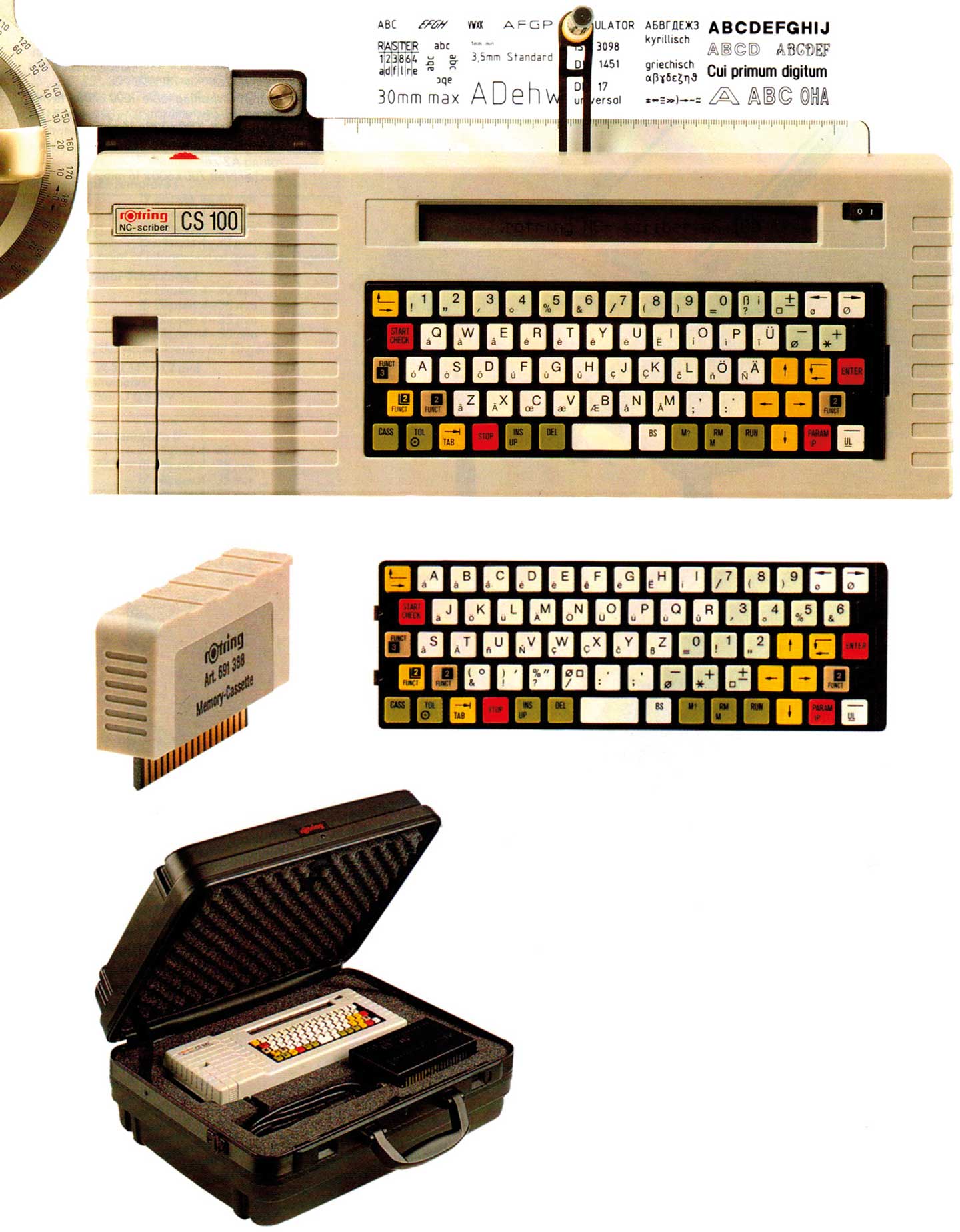
[8] Set-up of the Rotring NC-scriber model CS 100, c. 1990. In a matter of seconds the numerically-controlled plotter could perform letterings from three built-in fonts including ISO 3098 with character sets for Latin, Greek and Cyrillic, in three available widths plus italics, and monospaced if needed. Additional cassette cartridges provided memory and even more fonts. In addition to the default QWERTY keyboard, Rotring supplied an alternative board with keys in alphabetical sequence. The control unit and all other hardware pieces could be stored in a handy case for transport. Reproduced from the 1990 Rotring Catalogue, from the collection of Alexander Roth.
It was perhaps the availability of ISO 3098 on Letraset’s dry-transfer lettering sheets in 1976 when the name Isonorm was first used.9 Originally introduced as ‘Isonorm 3098 Typ B’ in upright and italic styles, it included both versions of ‘a’ and ‘7’.
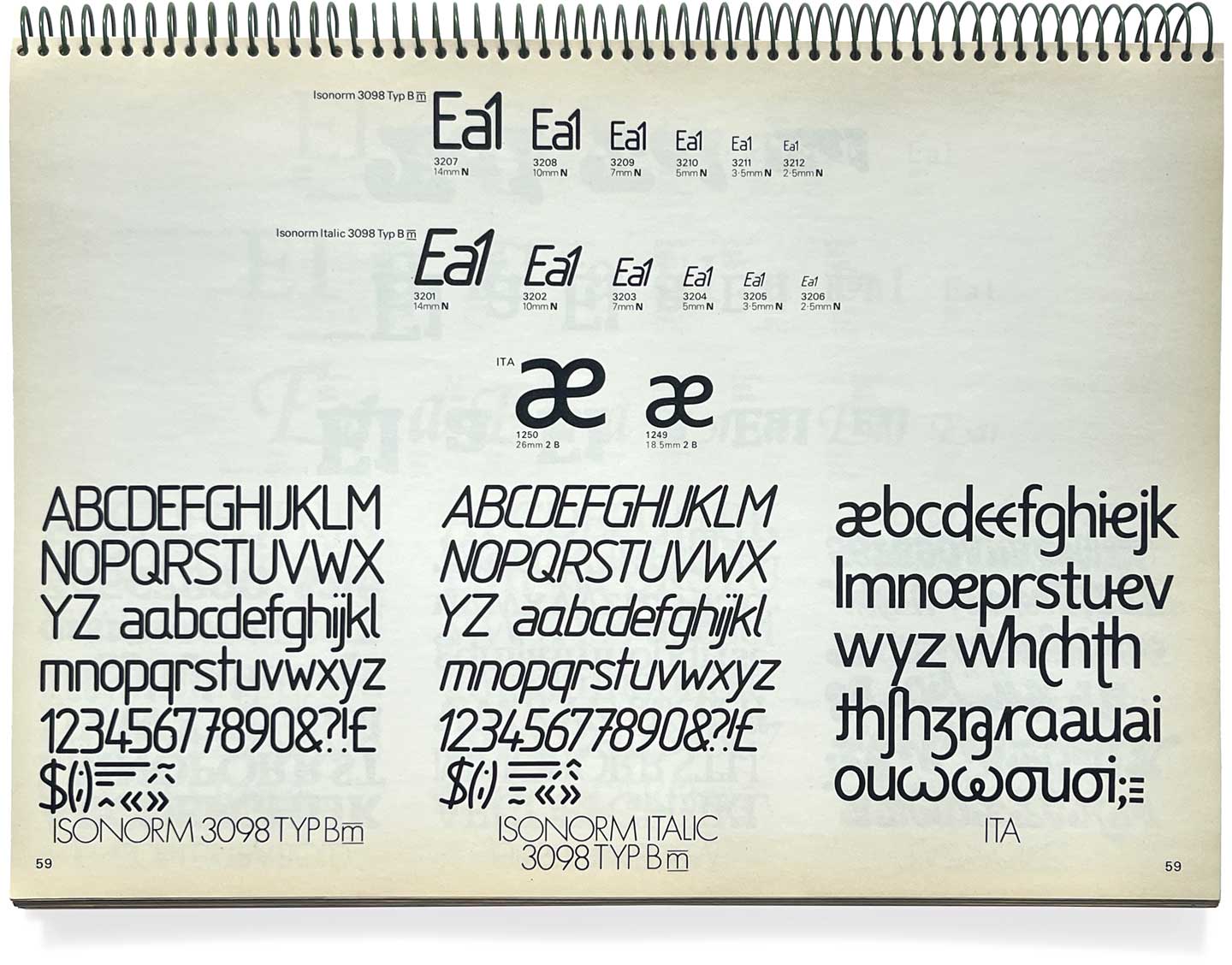
[9] Isonorm 3098 ‘Typ B’ in upright and italic weights, showcased in the 1976 Letraset International Ltd. catalogue comprised of over 330 typefaces. With kind permission from the collection of Erik Spiekermann.
With the arrival of computers and the establishment of numerical outline description of letterforms in the early 1980s, especially after the introduction of PostScript technology a few years later, Isonorm gained popularity through its availability in digital font formats from a variety of digital type manufacturers. Among other applications, Isonorm became the popular centerpiece of Rotring’s visual identity (alongside Futura for long copy) used in a variety of applications, ranging from advertisement and company brochures to product lettering and packaging for much of the 1980s.10
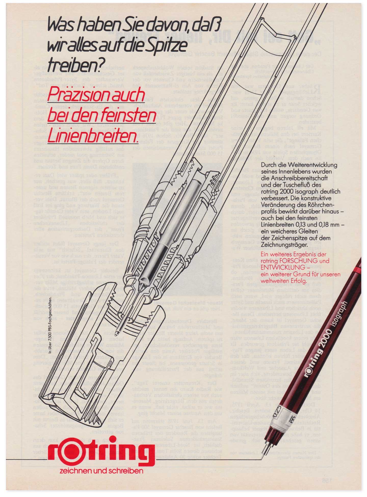
[10] Original Rotring print advertisement from the 1980s featuring Isonorm Italic (with a two-storey ‘a’) alongside Futura. Note the upright lettering in a single-storey ‘a’ on the Isograph pen. From the collection of Alexander Roth.
At the same time, the availability of new typefaces through the emerging digital technologies displaced Isonorm from its natural habitat of the drafting table. Drafted by engineers who follow mathematical ratios rather than typographic rules of optical corrections, alphabets like Isonorm maintain the intriguing illusion of not being designed at all — a genre that deserves recognition, because no one else dared to create these letterforms.
Author: Ferdinand Ulrich
Sources:
• Gutsche, Siegfried: Plakatschrift. Lehrbücher für die Berufsausbildung, Berlin: Volk und Wissen, 1959.
• Kuhn, Robert et al. (eds.): Schriftgestaltung. Schriften zur Kunsterziehung, vol. 22, Berlin: Volk und Wissen, 1968.
• ISO, DIN and TGL specifications of the alphabets mentioned in this essay, Letraset type specimens and Rotring brochures.